
Presentation
A guided sequence
Sparse content and deliberate pacing, with the presenter supplying context. Flat surfaces can work when they are not mistaken for controls.
Object Edge · Design system extension
I expanded the rules for an existing visual system so it could support product interfaces and web content, then brought the criteria into discussions with leadership, Development and QA.
the problem
The initial system established a visual direction for Object Edge, but did not sufficiently define how that direction should work across presentations, products and websites. In application, I found inconsistent hierarchy, contrast and accessibility issues, and pages where text density and visual treatments made the main task harder to identify.
A narrated slide can rely on someone to explain it. A product screen has to communicate its purpose, available actions and changing state while someone is using it. My work addressed that gap while retaining the established brand foundation.
I evaluated the applications, expanded the guidance for different contexts, explored improvements in Claude Design and developed the examples and UX criteria used in the company presentations.
Company leadership created the original system. A developer subsequently began applying the changes in code with BMAD. I do not claim authorship of the original identity or of that implementation.
01 · rules by context
I separated the shared visual foundation from guidance for each medium. Palette, typography families and spacing could remain recognizable while hierarchy, controls and feedback received rules appropriate to the task.
Presentation
Sparse content and deliberate pacing, with the presenter supplying context. Flat surfaces can work when they are not mistaken for controls.
Product
Recognizable actions, clear text roles and relevant interaction states. Visual treatments need a functional reason, such as communicating selection or focus.
Web
Scannable structure, recognizable links and responsive behavior. A visitor may arrive halfway through a page without a presenter to guide them.
The extension gave teams a way to discuss when a brand treatment needed adaptation. A control that resembles body text, for example, may preserve the visual style while leaving its behavior unclear.
02 · hierarchy in practice
Hive’s Builder mode changes the knowledge graph and automations used by the organization. That consequence deserves attention. A personalized greeting does little to help someone understand what they are about to modify.
Current production · content excerpt
Tools in this mode modify the knowledge graph and automations. Changes affect the organization.
The greeting receives headline emphasis, while the consequence appears as a separate warning.
Claude Design exploration · content excerpt
Design the graph, automations and connections the workspace runs on.
Changes here apply to everyone.
The page purpose becomes the heading, with the mode and its consequence connected in the reading order.
Illustrated content excerpts based on the supplied production and proposal screens. These are not full screenshots or a historical before-and-after comparison.
I explored a large introductory panel and a more compact explanation. The larger treatment makes the consequence prominent, but takes space away from the tools. The compact direction raises a useful next question: can someone identify the mode and its scope without repeated onboarding?
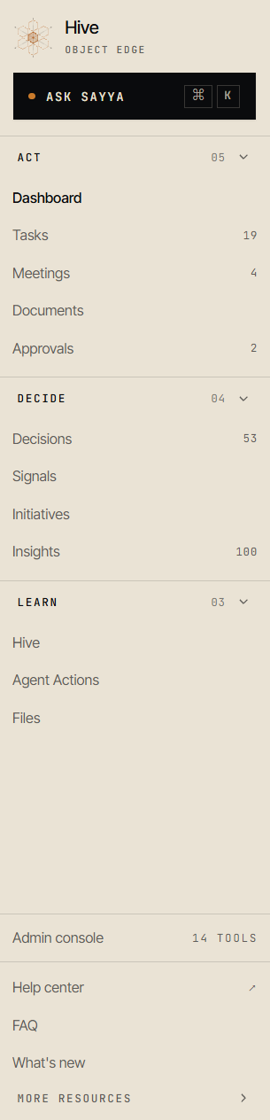
The sidebar exploration organizes destinations into expandable groups and separates administrative resources. This gives the navigation structure beyond a flat list.
Collapsed groups make the first view shorter, but add a step and can hide unfamiliar destinations. The labels and grouping still need to be checked against the tasks people perform.
The current production screens already share some patterns with the explorations. I do not have the original starting screens, so these images cannot establish the complete history of the changes.
03 · operational guidance
I used the training to make a component’s missing states visible. An action needs to communicate progress, completion and recovery wherever those states are relevant. Otherwise, development and QA have to infer the intended behavior.
The action has a recognizable boundary and a visible focus treatment.
Feedback confirms the request is in progress and prevents another submission.
A message explains what happened and offers a next step: choose another approver.
Illustrative interaction guidance from the presentation, rather than a demonstration of a released component.
The training compares a blocking payment error with a warning and a routine sync notice. The error receives priority and a recovery action. Color supports the distinction alongside labels and message structure.
The contrast example in the deck reports 2.9:1 for a bright accent and 6.9:1 for a darker accent on the sampled background. I proposed using the darker treatment for ordinary text and essential information. These are values for that example, not evidence that the whole product meets an accessibility standard.
the process
I supplied the system available at the time and the sites that needed improvement to Claude Design, then brainstormed approaches to hierarchy, interactions and accessibility. I evaluated the proposals against their intended tasks rather than treating generated screens as finished solutions.
The explorations and changes remained documented in the project. This was the record used for the subsequent work, rather than a claim that I had created a separate Figma component library or a complete token package.
I translated the findings into examples and a shared release checklist covering intent, hierarchy, interaction, states, accessibility, consistency and real conditions. The aim was to make UX risks discussable across the workflow, before a final review.
A developer began applying the changes in code with BMAD. This is the confirmed transition from the design work into implementation. It does not establish that every proposed change has shipped.
outcome and next step
The presentations took place with leadership, developers and QA. Participants suggested creating a Claude skill to support UX auditing during development. That suggestion is a concrete follow-up from the sessions, rather than a completed automation or a measured improvement in release quality.
Context-specific guidance, recorded design explorations, worked examples and presentations that gave several roles a common set of UX questions.
Implementation fidelity, behavior under real conditions and whether the criteria help teams identify issues earlier. The proposed audit skill would also need checks for evidence, missing context and invented requirements.
My main contribution was turning a visual foundation into guidance for decisions people make while building and using products. The next useful evidence will come from how that guidance survives implementation and repeated team review.