
Lounge Management System · Enterprise UX
Designing clarity into airport lounge operations.
A responsive decision-support experience that made complex access rules actionable for frontline agents, then evolved into a broader administrative platform.
Client and partner identities are omitted. The interface examples are original design exports with airline, program and traveler identifiers replaced.
Simple check-ins. Complicated decisions.
From the passenger’s perspective, entering a lounge should be straightforward. Behind that interaction sit overlapping rules for eligibility, memberships, guest allowances, timing, and cases requiring human verification.
The existing tool had become dated and difficult to navigate. Some steps still depended on manual workarounds, including printing tickets instead of completing the interaction inside the application.
We needed a simpler experience for agents handling real passenger situations, without forcing them to interpret all the rules that governed access.
Explain the reason.
Make the next action obvious.
Owning design across a multidisciplinary team.
I joined at the beginning of design, after initial discovery and much of the product direction were already defined. Product managers and stakeholders brought requirements and user stories; I was responsible for translating them into the product experience.
As the only designer on the team, I worked closely with the PM, PO, engineers, and client stakeholders throughout sprint planning, daily meetings, reviews, and retrospectives. Regular input from operational experts, including people with firsthand lounge experience, helped resolve ambiguous scenarios and refine the UI.
Helping agents make the right decision at the right moment.
The MVP centered on the agent’s workflow: identify a traveler, understand eligibility, handle exceptions, and take an appropriate next step. The interface needed to keep that process consistent even when the underlying outcomes differed.
One familiar surface for multiple access outcomes.
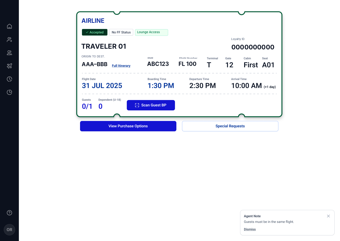
We used a consistent passenger-ticket layout, with prominent states, explanations, and available actions. The same structure supported approved access, denied access, and cases requiring human review.
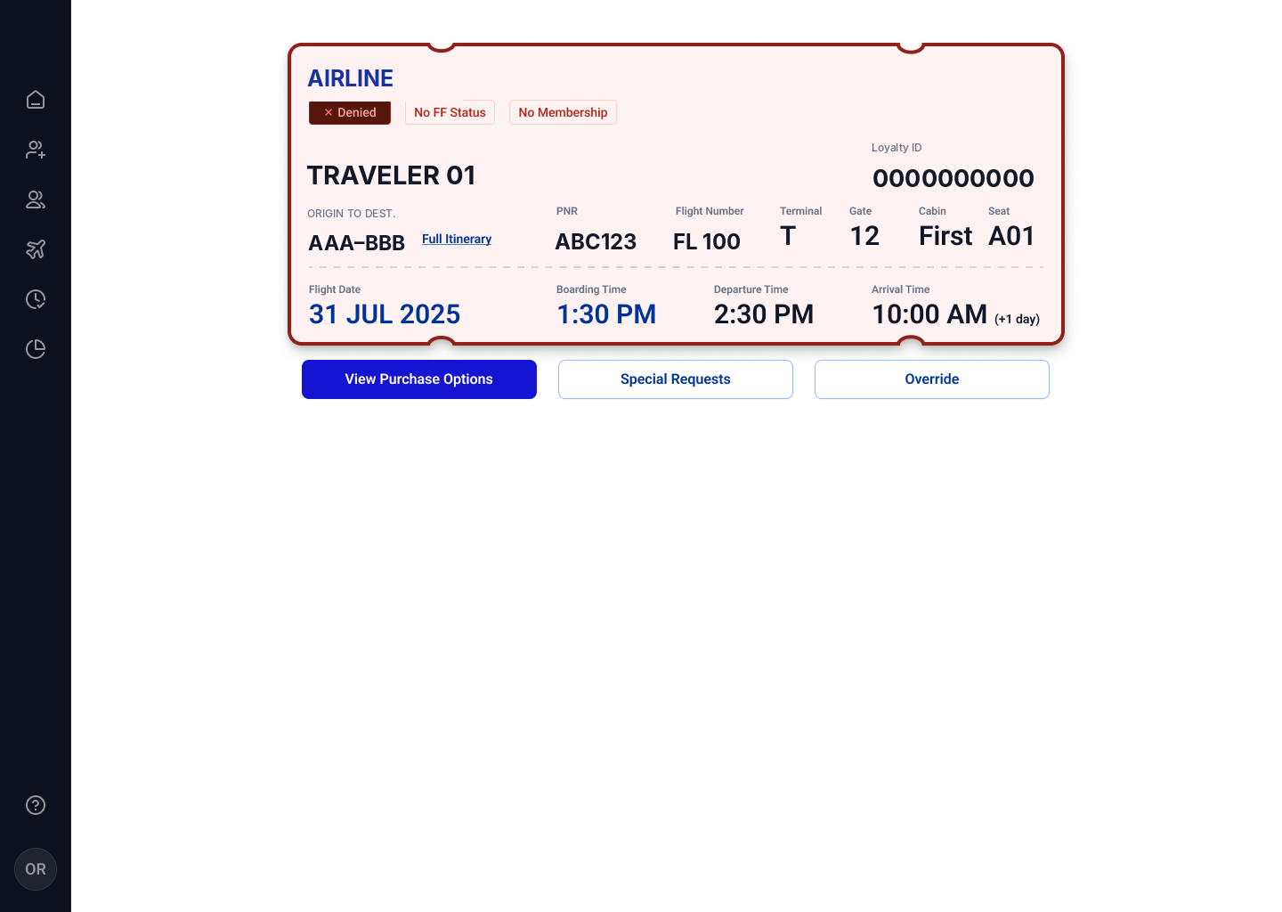
Anonymized crops of the original desktop screens provided for this case. Select an image to view its full screen.
Color and explicit labels communicated status, while reasons such as missing membership or an invalid entrance window explained what had happened. Keeping the information architecture stable across states let agents focus on the difference that mattered: the decision and what they could do next.
Automate the checks. Keep human judgment where it matters.
Not every traveler could be evaluated automatically. Some cases, such as an unaccompanied minor or a traveler needing documentation review, required an agent to make a judgment.
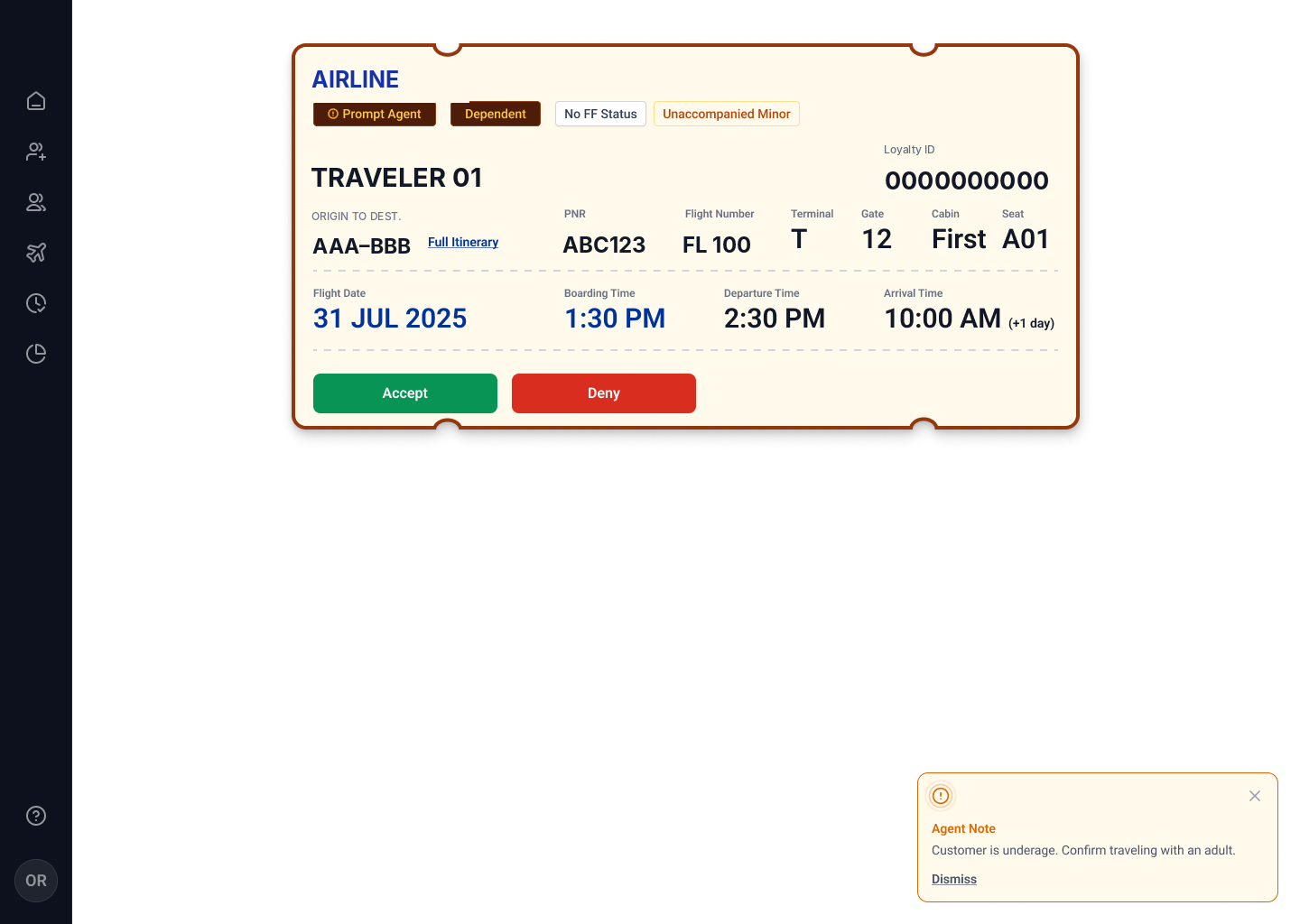
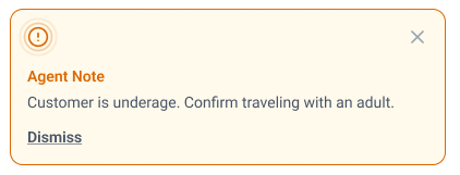
The notice tells the agent what to check. It does not enforce verification.
Original agent-review ticket and Agent Note, anonymized. The decision controls were part of the ticket, not the toast.
The design distinguished guidance from enforcement. The contextual note explained what needed checking, but the system did not require an additional confirmation before approval. This kept the interaction lightweight while leaving the final verification responsibility with the agent and their operational process.
Keep guests, dependents, and alternative access in context.
A traveler’s eligibility could affect others traveling with them. The interface needed to handle guest entitlements and dependent rules without turning one check-in into several disconnected workflows.
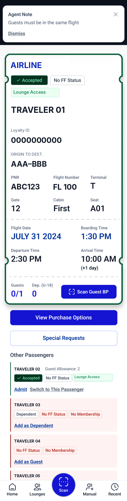
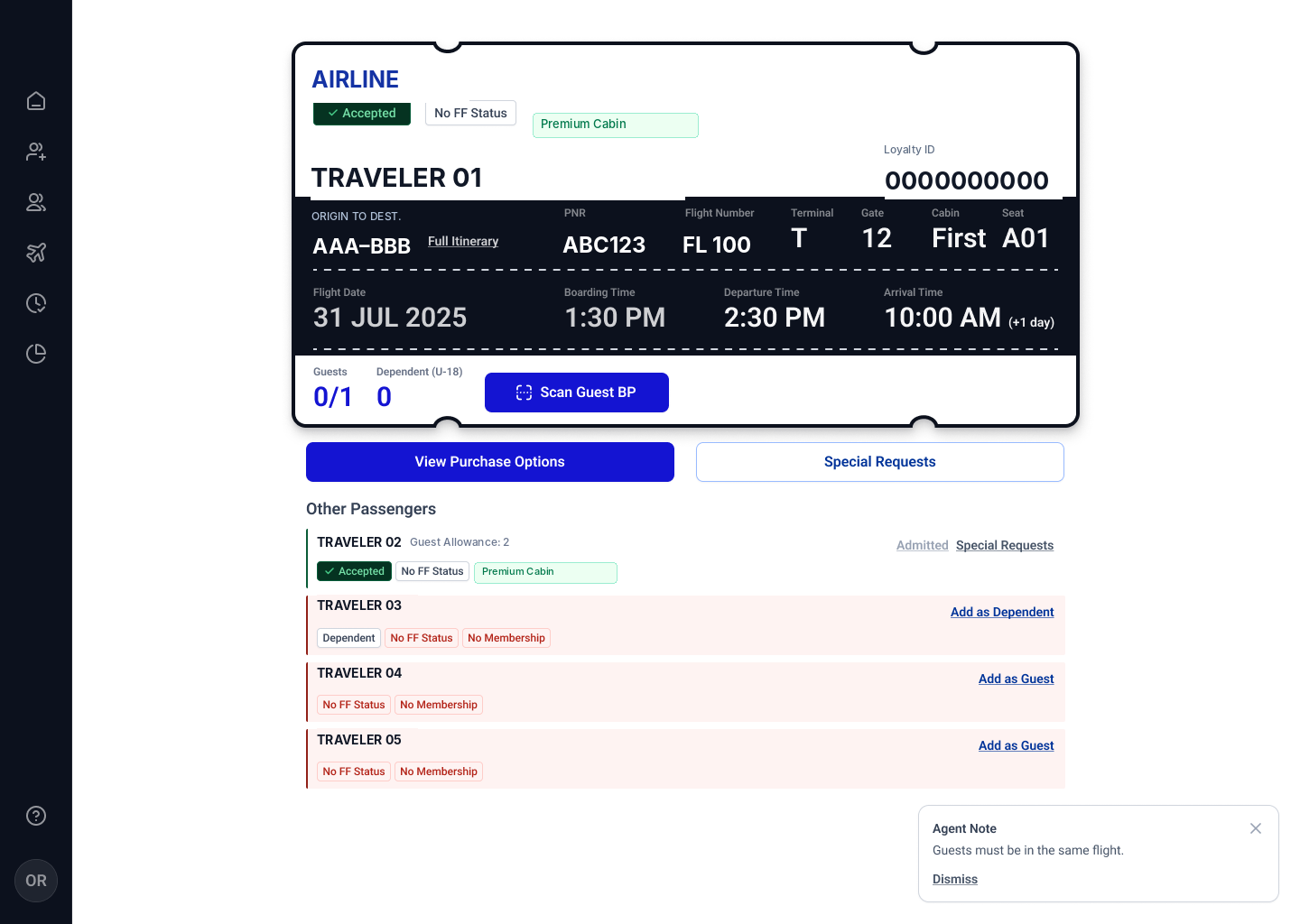
Accompanying travelers appear in context, with visible entitlements and relevant actions such as Add as Guest or Add as Dependent.
Actual mobile design and a desktop crop of the accompanying-passenger list. Brand and passenger identifiers have been replaced.
The primary passenger view displayed the applicable guest allowance and actions to add or scan additional travelers. Supported alternatives, such as purchasing a one-time pass when capacity allowed or using an authorized override, could also be surfaced when relevant. The aim was to make the next valid path understandable without exposing the full eligibility logic to agents.
Preserve decision clarity across screen sizes.
On desktop, passenger and flight information could sit side by side. On mobile, the same decision surface prioritized status first, then details and actions, with scanning remaining prominent.
The same real design, shown at desktop and mobile widths. Both images are anonymized screenshots from the supplied exports.
Validated in an airport environment. Refined through real operational feedback.
We regularly reviewed work with client stakeholders and people familiar with lounge operations. Approximately three to four months into development, the MVP was demonstrated on-site at an airport over several weeks.
Operational feedback helped clarify rules and confusing scenarios as designs evolved.
The agent experience was exercised in an airport setting and approved.
Technical bugs were addressed; premium passenger presentation was made more distinct.
Making premium passenger categories more recognizable
After the airport demonstration, we refined the visual distinction for premium passenger categories while preserving the same ticket information hierarchy. These are anonymized crops of the original designs, not recreated layouts.
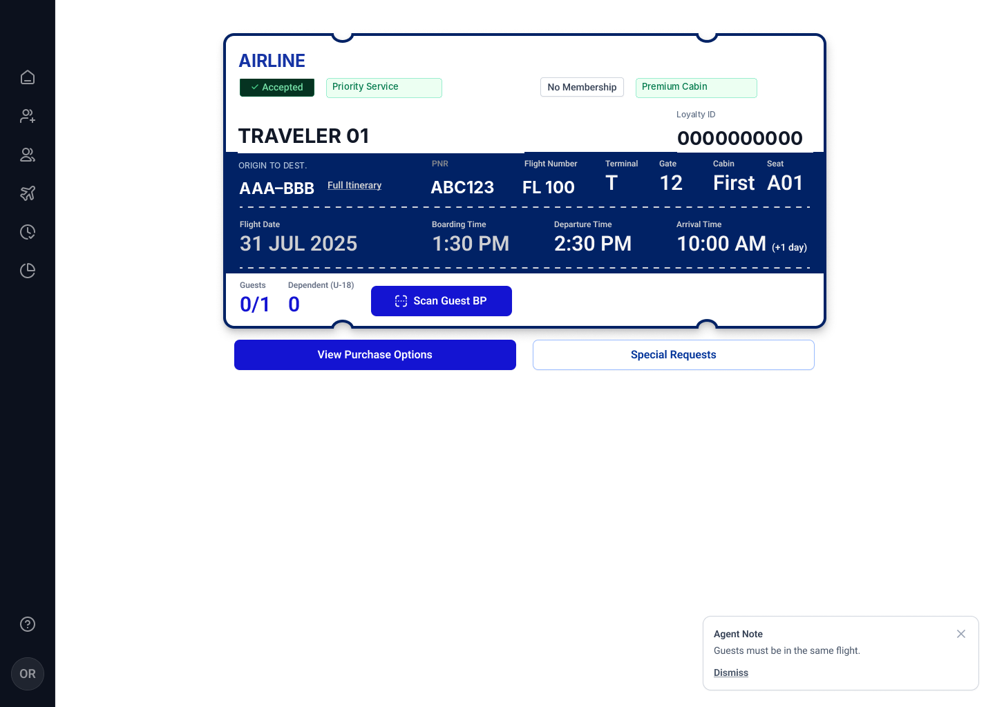
Evidence boundary: The MVP was approved, and the issues reported during the demonstration were primarily technical. I do not have measured check-in times, task-success rates, or adoption data, so I am not claiming a quantified productivity improvement.
From one operational workflow to a multi-role platform.
Once the agent MVP was approved, our work shifted to administrative experiences. The platform had originally been conceived to support multiple airline organizations, which required differentiated access and configuration tools.
Different roles. Different levels of control.
Organization administrators managed access, users and reporting. Platform administrators managed participating organizations and higher-level settings. The rule configuration work helped make eligibility conditions maintainable outside the agent experience.
Rule Engine followed the MVP
Rule configuration belonged to the later administrative phase. The images in this case document the agent experience.
Different users, opposite needs
Agents needed the system to simplify complex business logic. Administrators needed to configure and maintain that logic. The later design work included organization management, user permissions, reporting, and a rule-configuration experience.
What reached users
These administrative experiences were developed and used by a small group before the project was paused. Their limited use supports an implementation claim, not conclusions about broad adoption or long-term effectiveness.
What shipped, what was validated, and what remains unknown.
The result was a developed operational experience approved after an airport demonstration, followed by a developed administrative platform with limited initial use.
Agent-facing flows were implemented, demonstrated on-site, and accepted after follow-up fixes.
Eligibility explanations, manual reviews, guests, and alternative access paths were represented in the UX.
Multi-role administration and rule configuration reached initial users before the pause.
No dependable metrics are available for speed, error-rate reduction, or sustained adoption. This case intentionally makes no numerical impact claims.
The goal was never to make the rules disappear. It was to make them manageable.
Clarity beats rule visibility. Frontline users need outcomes, reasons, and next actions. The full logic belongs in administrative tools designed for specialists.
Exceptions are part of the primary experience. Human judgment, guest policies, and alternative access cannot be treated as edge cases to design at the end.
Guidance is not enforcement. Our contextual notes helped agents act, but did not ensure every manual verification happened. I would explore selective verification confirmation and auditability in a future iteration.
Measure outcomes earlier. Alongside qualitative validation, I would define baseline and post-launch measures for check-in time, manual workarounds, and handling of exception scenarios.